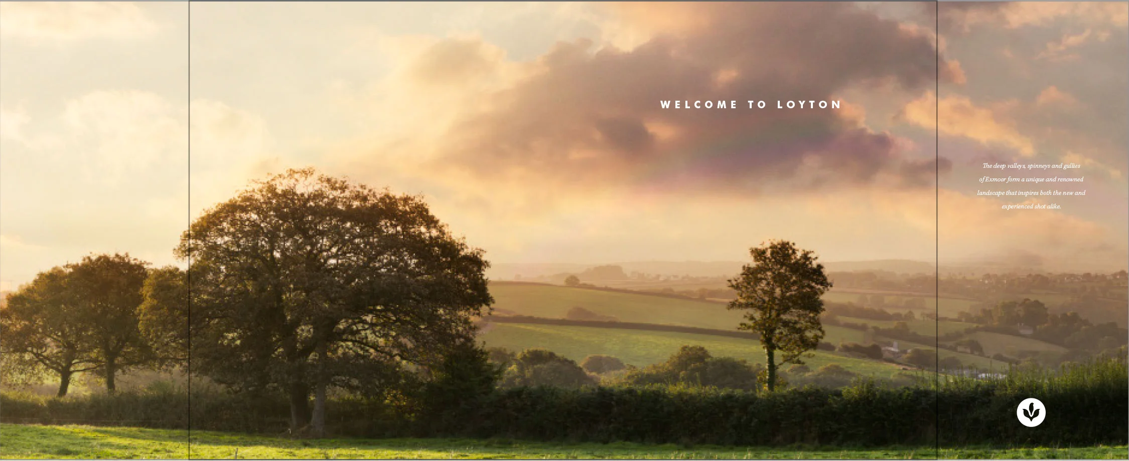
Loyton

Loyton
The essence OF the PERFECT English countrYSIDE

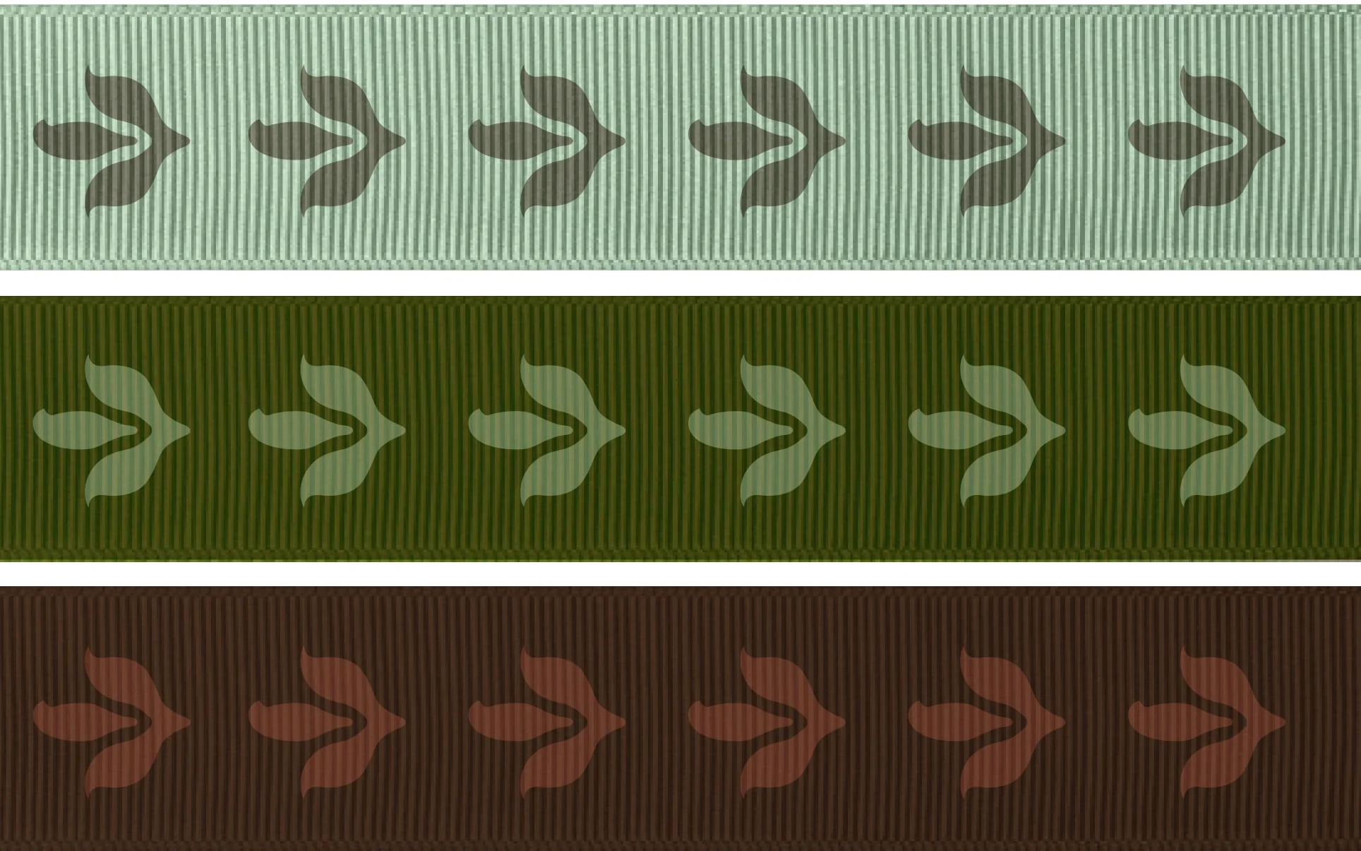
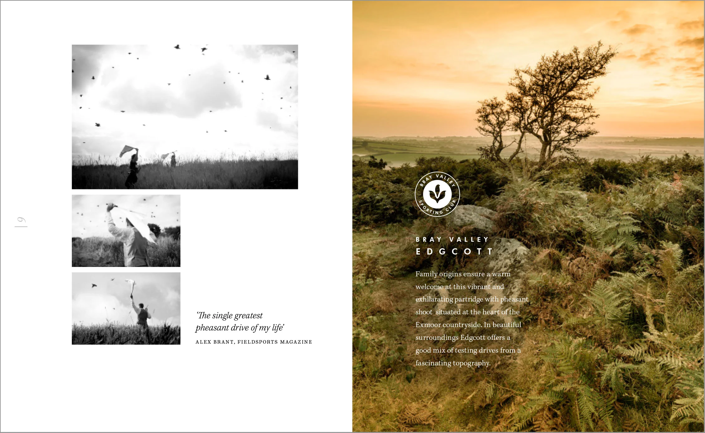
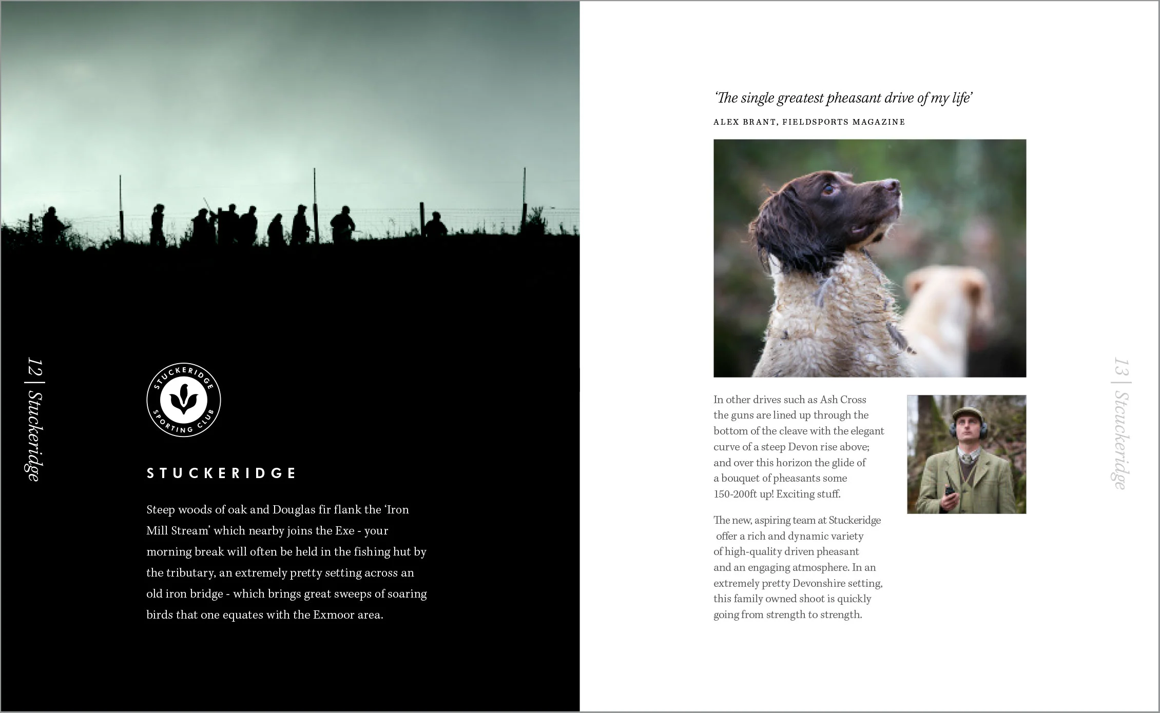
A rebrand for a family business in a Devon countryside that adopted an icon with a strong ‘organic’ feel taking an inspiration from flora and fauna of the region. The process brought several different elements of the business together that now offer a coherent single minded narrative.

WHAT I LOVED ABOUT IT: 

Brand Concept | Logo & Typography | Positioning | Stationery Brochure | Game Cards | Print Artwork | Website Design Emails and Newsletters Design | Brand application to packaging Illustrations

LoytonLogo.jpg
LoytonDev.gif
LoytonPatterns.gif
LoytonWater.jpg
LoytonLayout_Cover.jpg
LoytonLayout.jpg
LoytonLayout_01.jpg
LoytonChristmas_02.gif
LoytonChristmas_01.gif